Everything began with an interview to Gabi Heras I read. I had gone through a very hard experience in ICU (one ICU sometimes without H, sometimes with H, perhaps the least) to return home, and wandering in the internet, I went into that mirror that was for my that interview. I was deeply thrilled by the project, resounded in my every one of his words and then the impulse “I would be part of this” was born in me.
So, I followed it :). I wrote to Gabi explaining the same and telling him that I could offer me to participate in HU-CI from what I knew, that was the world of design, marketing and music. And there, my journey in this #benditalocura began.
As we know this is a project made many roads that converge, which as links in a chain we will do so increasingly large, trying to get away his message, to achieve that each person/patient of each ICU of the planet could transit on the hard experience that is to have impaired health, often between life and death (sometimes even staying in the latter) being cared with the capital letter H of HUMAN.
One of the links was Víctor Peve: one day he thought to make the gesture of the H with the hands, saying that the H of HUCI already had an icon in Whatssap!. And soon, a lot of people around the world made pictures with that H, every day more and more people. The gesture had a meaning by itself.
We already had it. Those hands had to be in the new logo. The idea of Victor illuminating mine. Workable building. A logo that includes the gesture of the H, stroke clean hands and accompanied by a soft and rounded typography, because hands and fingers, are “rounded”, no sharp edges… Furthermore the softness of those hands which care best:).
Also was suggested from 8’s Group that will evolve the color Bordeaux that had the first logo to something more current, more live, and from there the funny magenta we have adoptted as own image. Gabi put much emphasis in Proyecto HU-CI is builded by many people, a worldwide movement. And from there emerged the idea of the logo was accompanied in the stationery and others, with a bonfire of hands. That was visually the record of joint effort of hundreds, thousands (millions someday?) of people working for a better world . The human soul on fire.
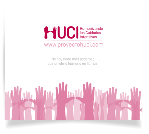
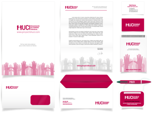
So there is the new logo of HU-CI, the new image that will accompany to this wonderful project for a time. I feel honored of having made it, participating in something that gives sense to life: to be part of that capital H for a LIFE written with capital letters.
Thank you,


Leave A Comment